
For the "history of art," I chose a piece by Claude Monet titled "San Giorgio Maggiore by Twilight." The colors in this piece are bright, but soft at the same time. For his time, Monet was and is still considered one of the greatest impressionistic artists of all time. He had a new use of color with vibrance that spread all over his canvas, but did it enough that it wasn't overpowering. It is obviously an impressionistic piece, but the contrast between colors makes it stand out a lot more than any other piece I have seen. Most of Monet's other pieces are a more soft and easy to look at. This piece has an edgy feel because of its dark colors. There is dominace with the castle on the left hand side, a small building on the right, and a medium reflection underneath the castle. This piece does not feature a human form. I have been encouraged, after this piece to experiment with more styles that I haven't tried before.
The next piece that could s how Visual Culture could be Andy Warhol's rendition of Marilyn Monroe. He used many bright colors for each piece he did of this particular picture. He is a founding artist of the
  term "pop art" which his art was focused on pop culture during his life. This work is very well known, as well as most of his pieces, but people connect with this one because of it being Marilyn Monroe. The Marilyn print takes up the whole canvas to be the focal point. Because it is a photo print the human proportions are mostly accurate. I am a big Monroe fan, therefore I am automatically drawn to the piece. I have been influenced to do art with pop culture because it is one of my main interests.
 how Visual Culture could be Andy Warhol's rendition of Marilyn Monroe. He used many bright colors for each piece he did of this particular picture. He is a founding artist of the
 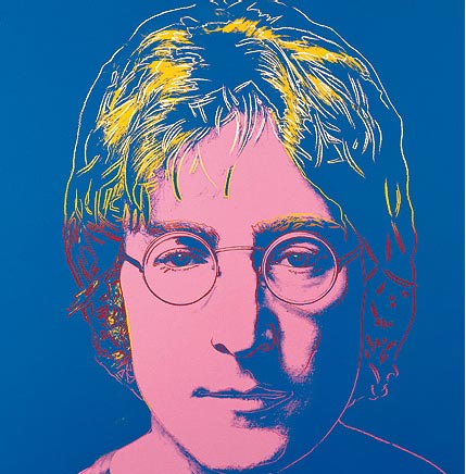 term "pop art" which his art was focused on pop culture during his life. This work is very well known, as well as most of his pieces, but people connect with this one because of it being Marilyn Monroe. The Marilyn print takes up the whole canvas to be the focal point. Because it is a photo print the human proportions are mostly accurate. I am a big Monroe fan, therefore I am automatically drawn to the piece. I have been influenced to do art with pop culture because it is one of my main interests.
 This piece is for Fashion Design. The colors used for this piece were basically used to plan out what the clothing would look like, in general, if it was finished. Cool colors are used for this piece. There is shading with the colored pencil to show the effect of the clothing. The form is taking up most of the page to get the full effect. The human form is proportionate because it is used to accurately display clothing. I haven't really been influenced by this piece, but it does make me want to try new things.


